Duration: Jan - Mar 2022
Software: Adobe Illustrator | Adobe Photoshop | Adobe XD
Mission: Destress users when they donate blood
Roles: UX/UI Designer, User Experience Research
Our Task
For this project, we were assigned to find a solution for better blood donating through user experience design. More specifically, designing a new application for users. Prior to designing, we watched this above video to find our pinpoints for change.
Problems with Donating Blood
While we were watching the previous video, we made pin-point notes during it. From what we gathered, we found:
-It can be disorganized (where do I go, where do I put this, etc.)
-Donators have to fill out paperwork prior to the donation which can make the whole process longer than it needs to be
-Some blood drives are inconvenient to attend to because of time
-They can be loud and overstimulating to some donators
-Overall, these pinpoints make the whole process stressful
Our Hypothesis
-Donators want to complete their background info prior to the donation
-Donators want more time flexibility to donate
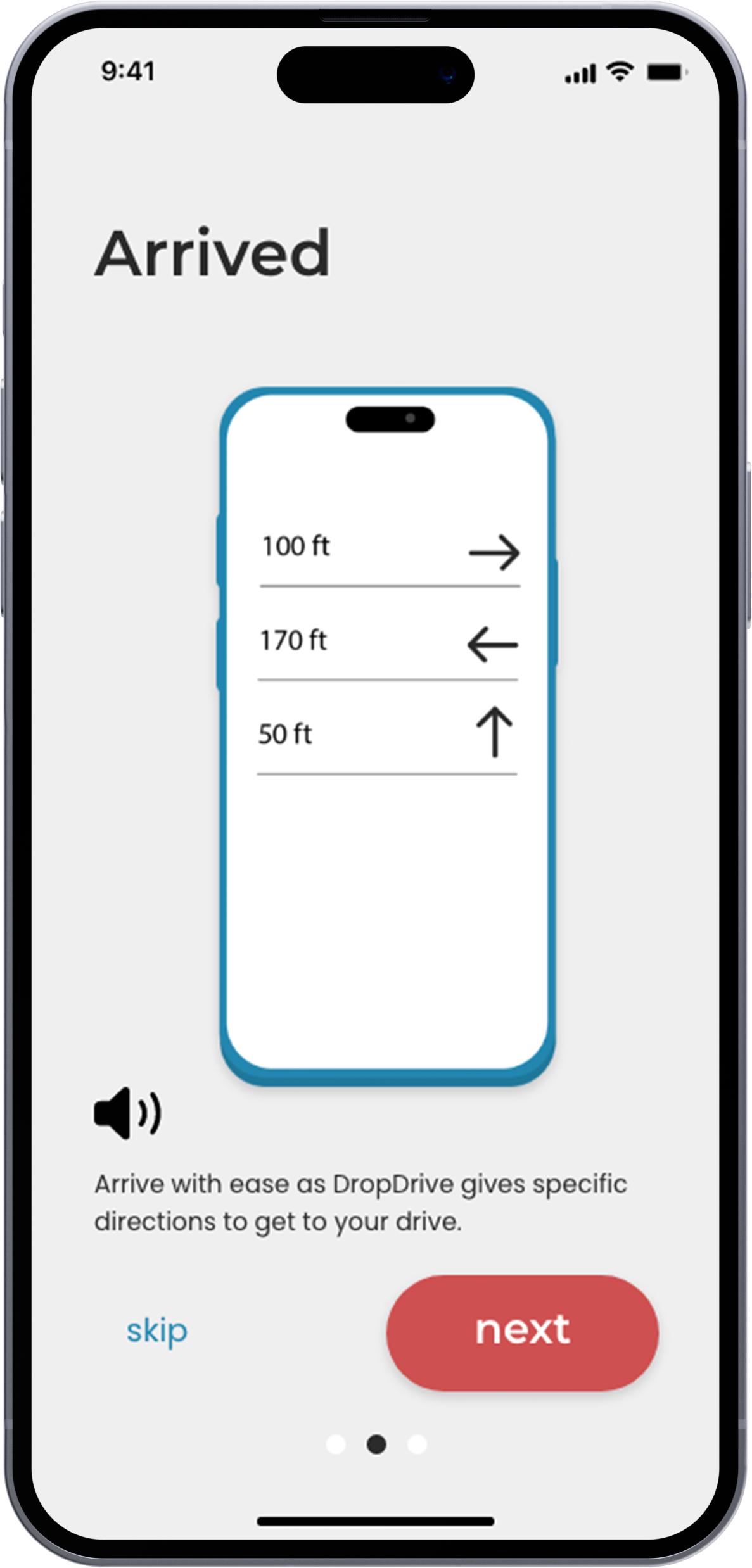
-Donators want to know exactly where to go when they get to their donation
-Donators want a peaceful and non-overstimulating experience
-Donators want a good reward from donating blood
Solution
This app solution, DropDrive, will allow users to schedule blood donations without popping a vessel!
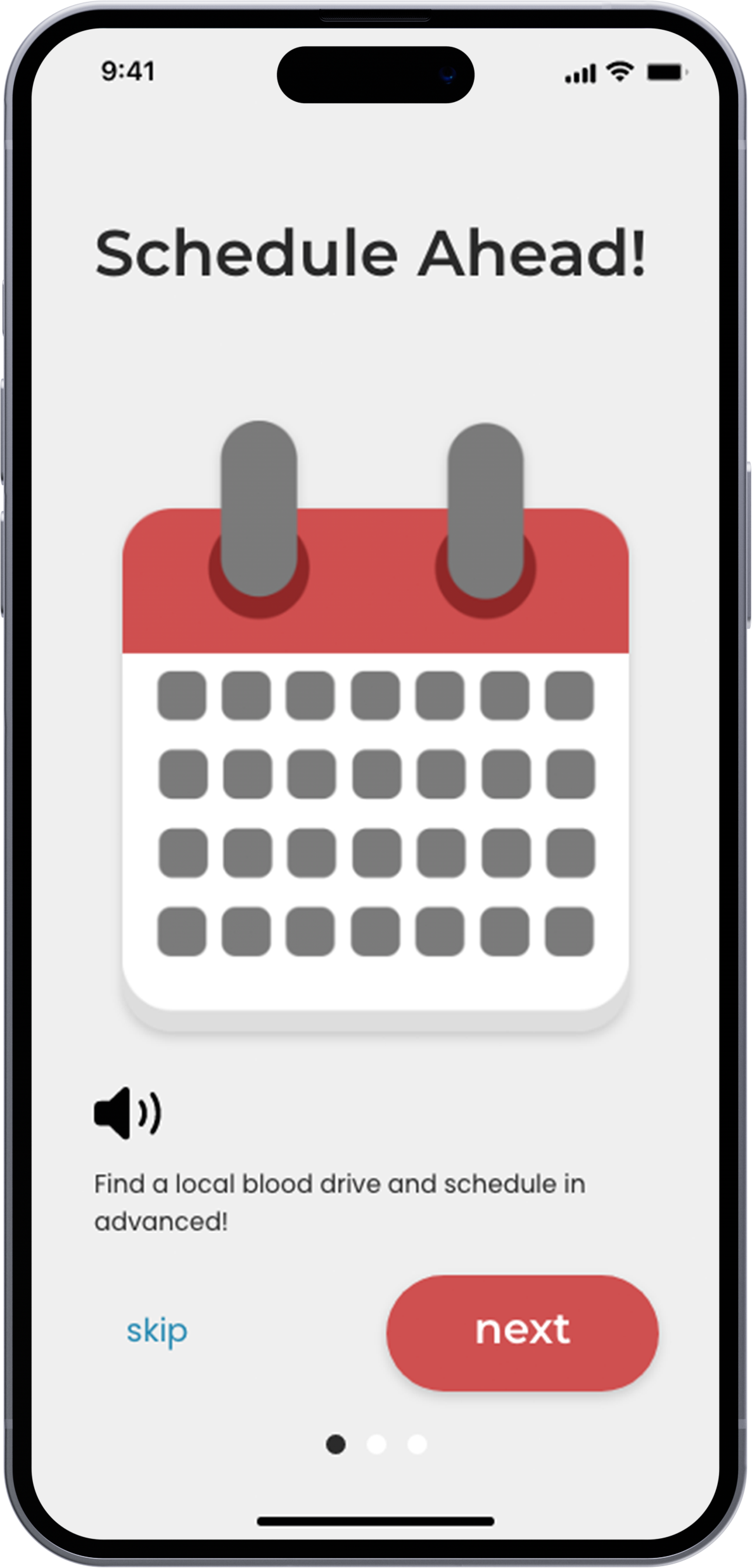
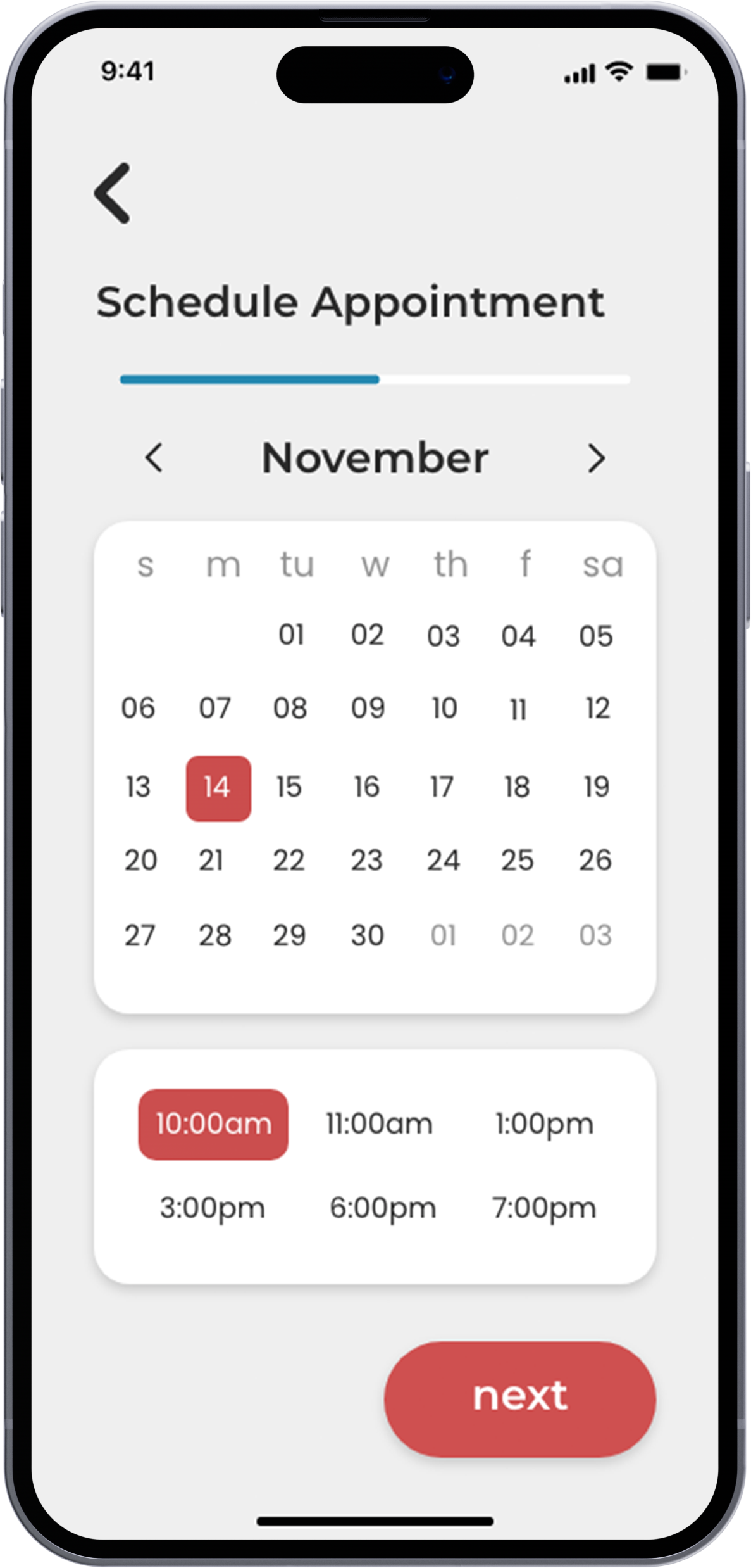
-DropDrive is flexible with users schedules
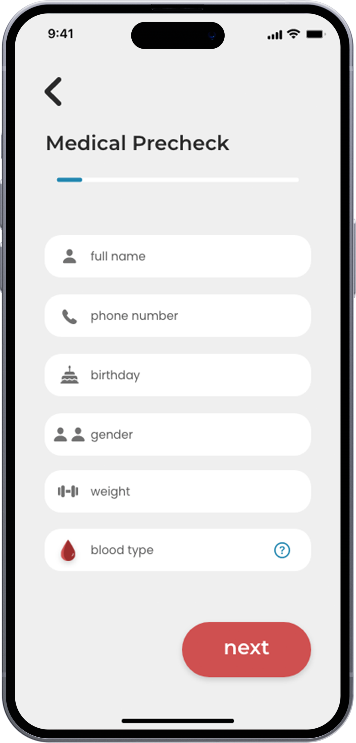
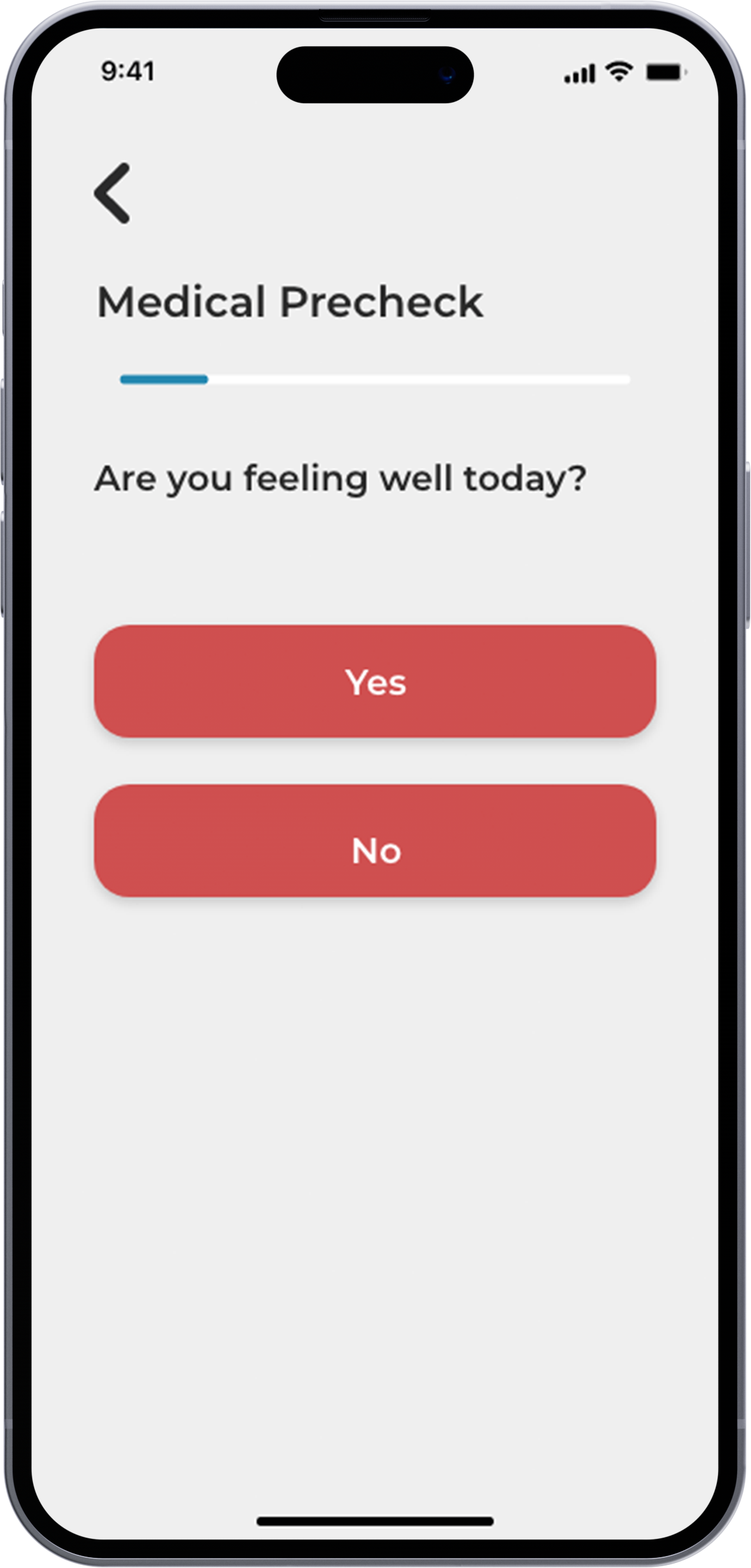
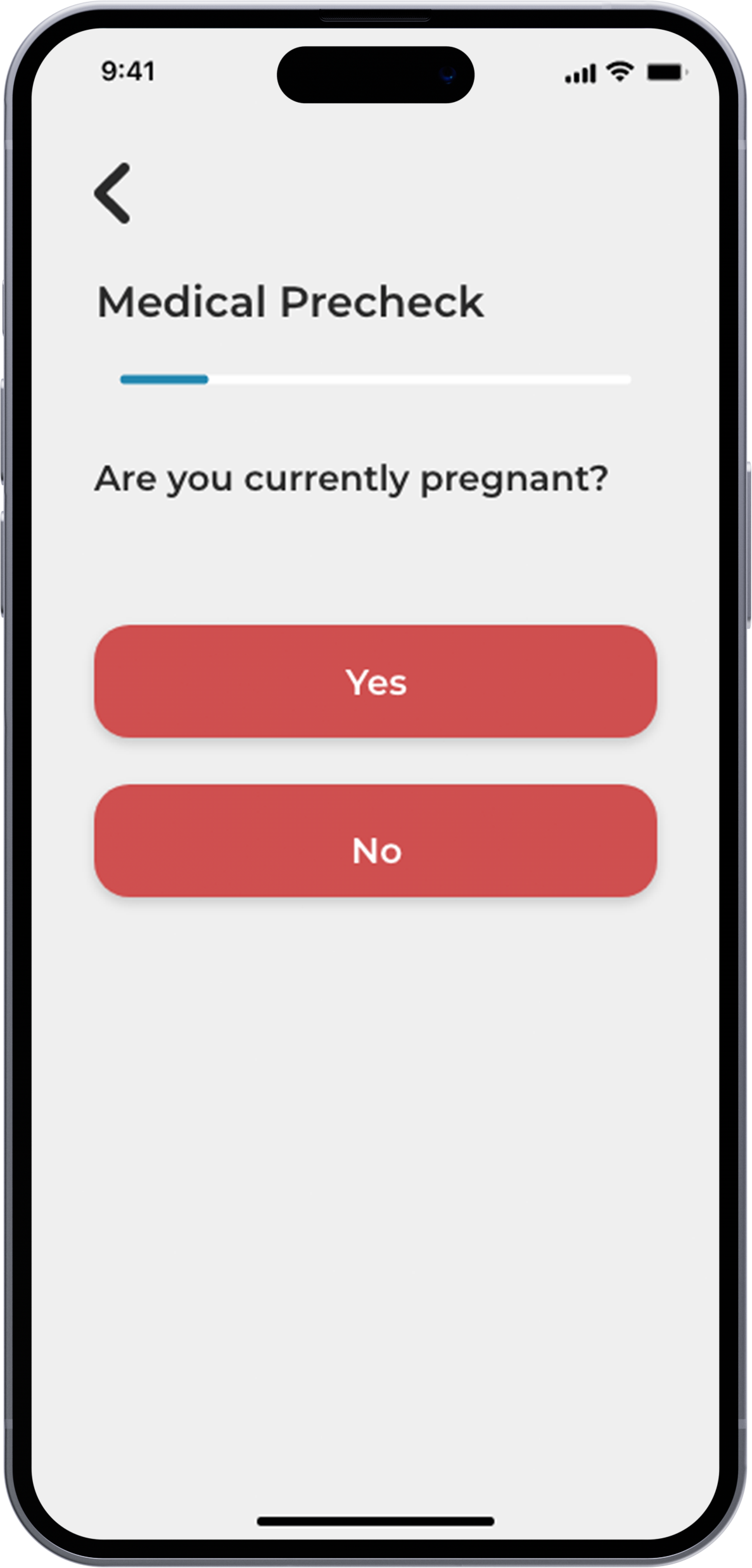
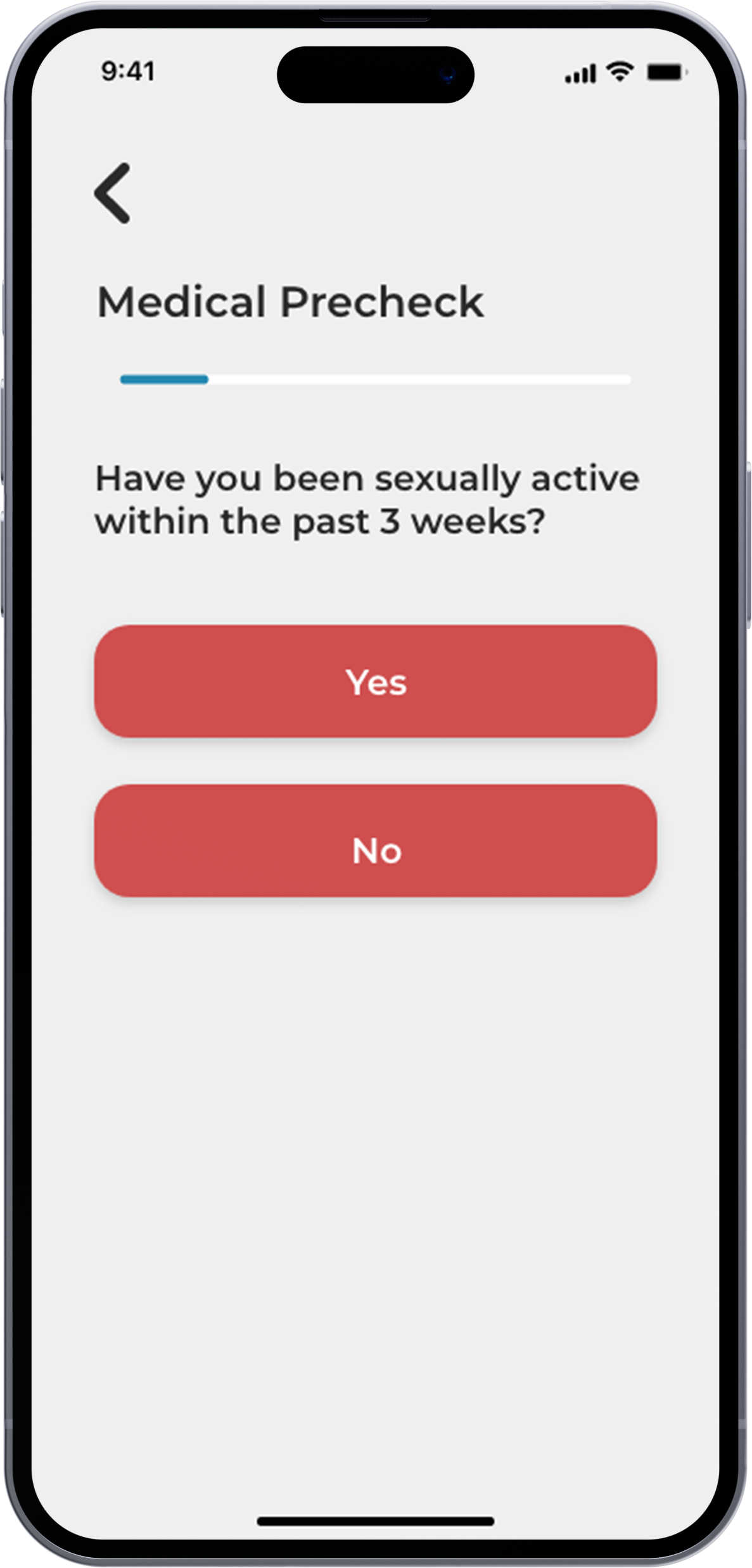
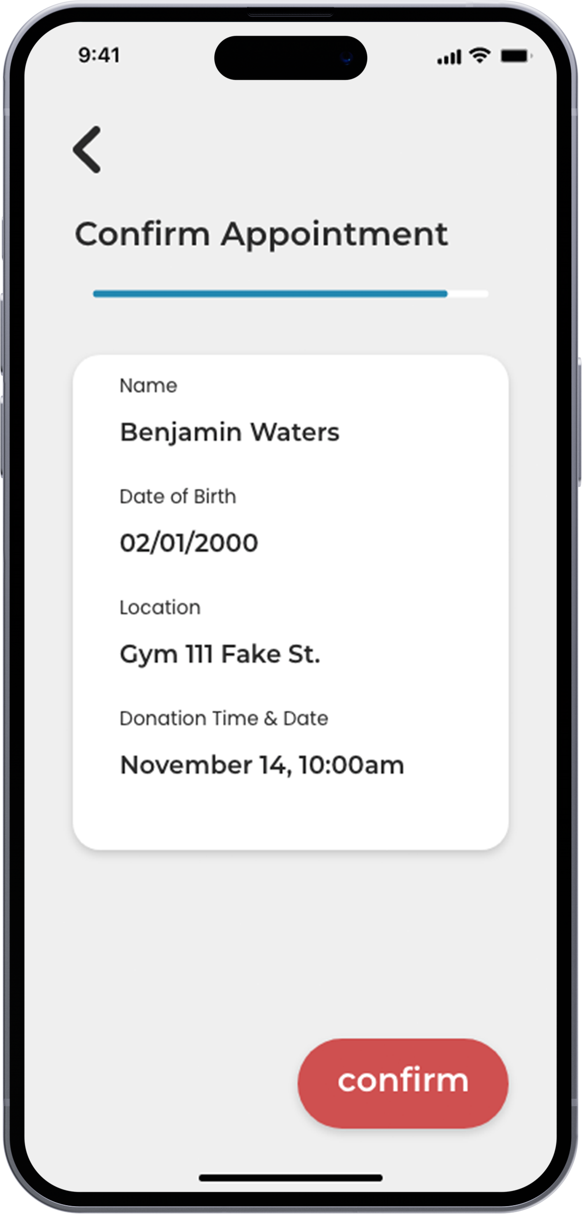
-DropDrive allows users to put medical and other information prior towards arrival
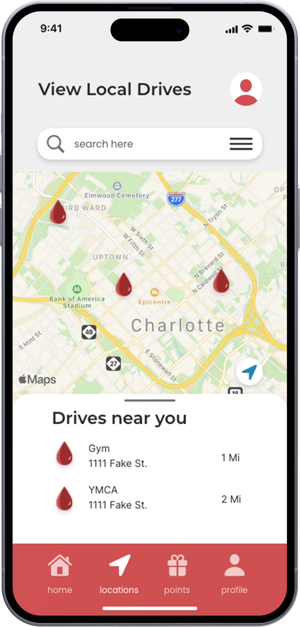
-DropDrive finds various blood drives near you that can specify with your needs (being overstimulated, worried, etc.)
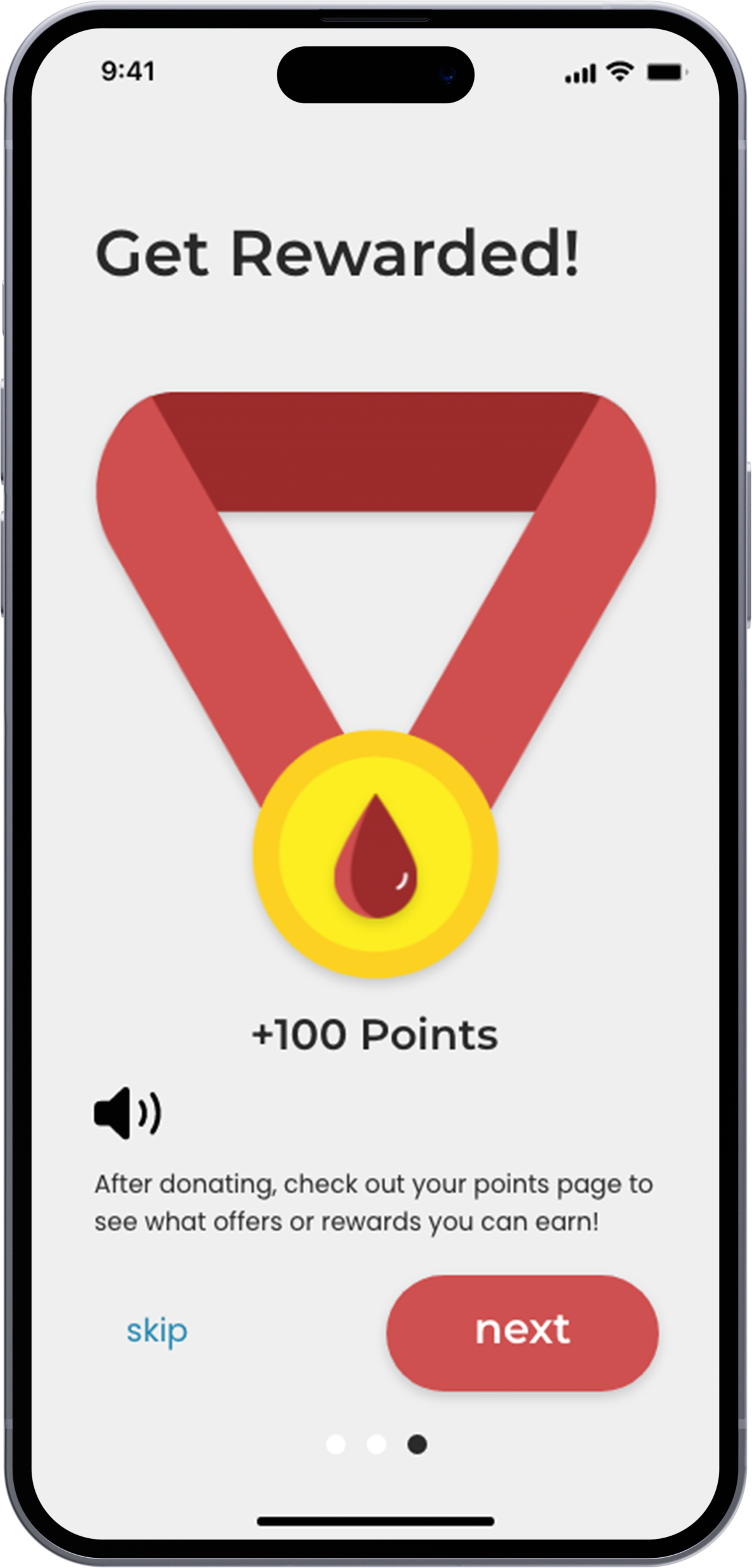
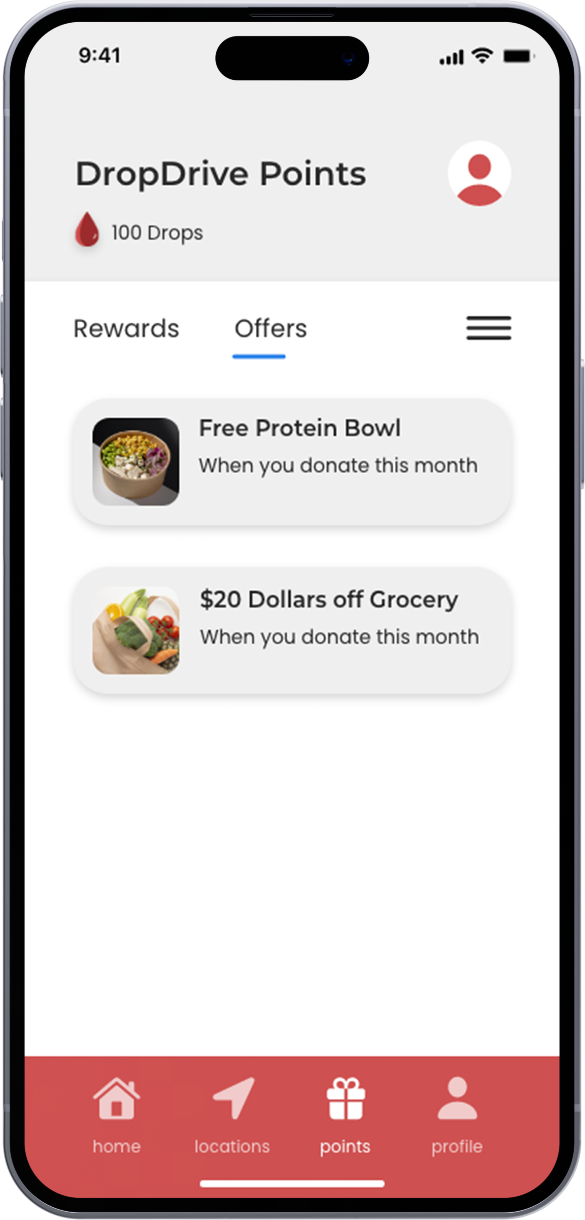
-DropDrive also gives you rewards for donating such as gift cards for certain retailers.
App Map
User Journey
Low-Fidelity WireFrames
Color Study & Typography
UX Visual Design
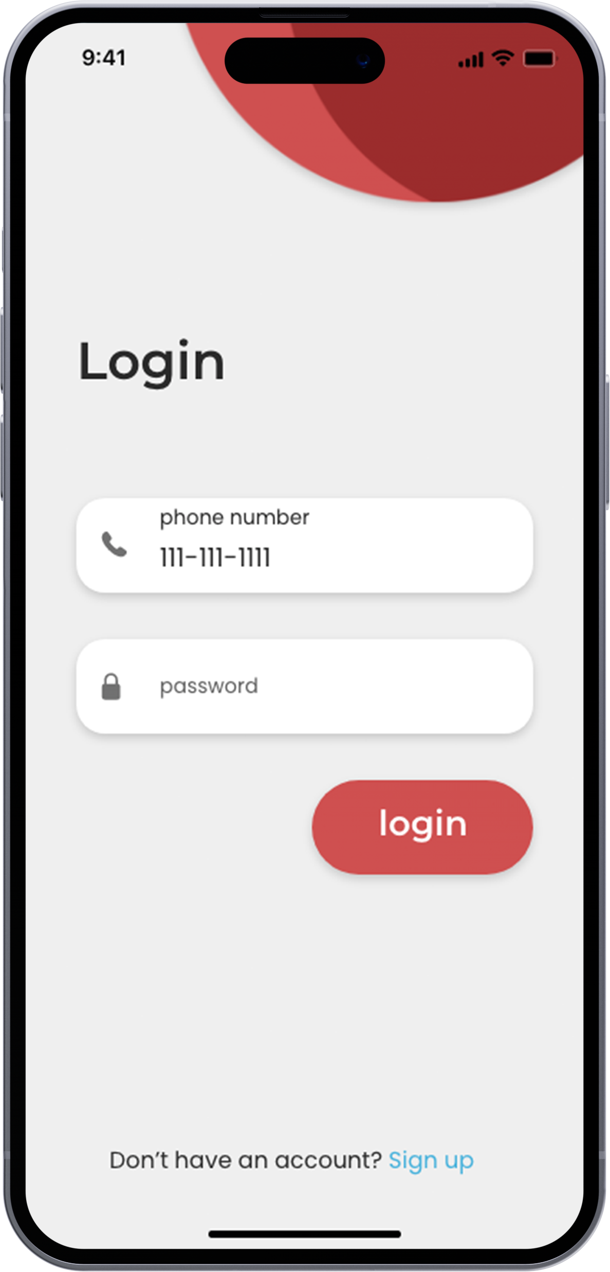
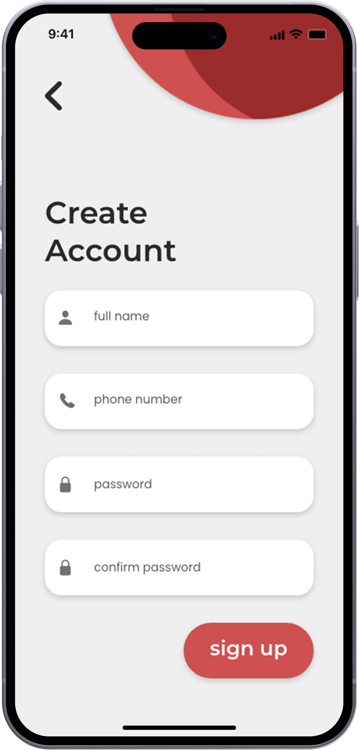
Login / Signup Screen

Tutorial Screens
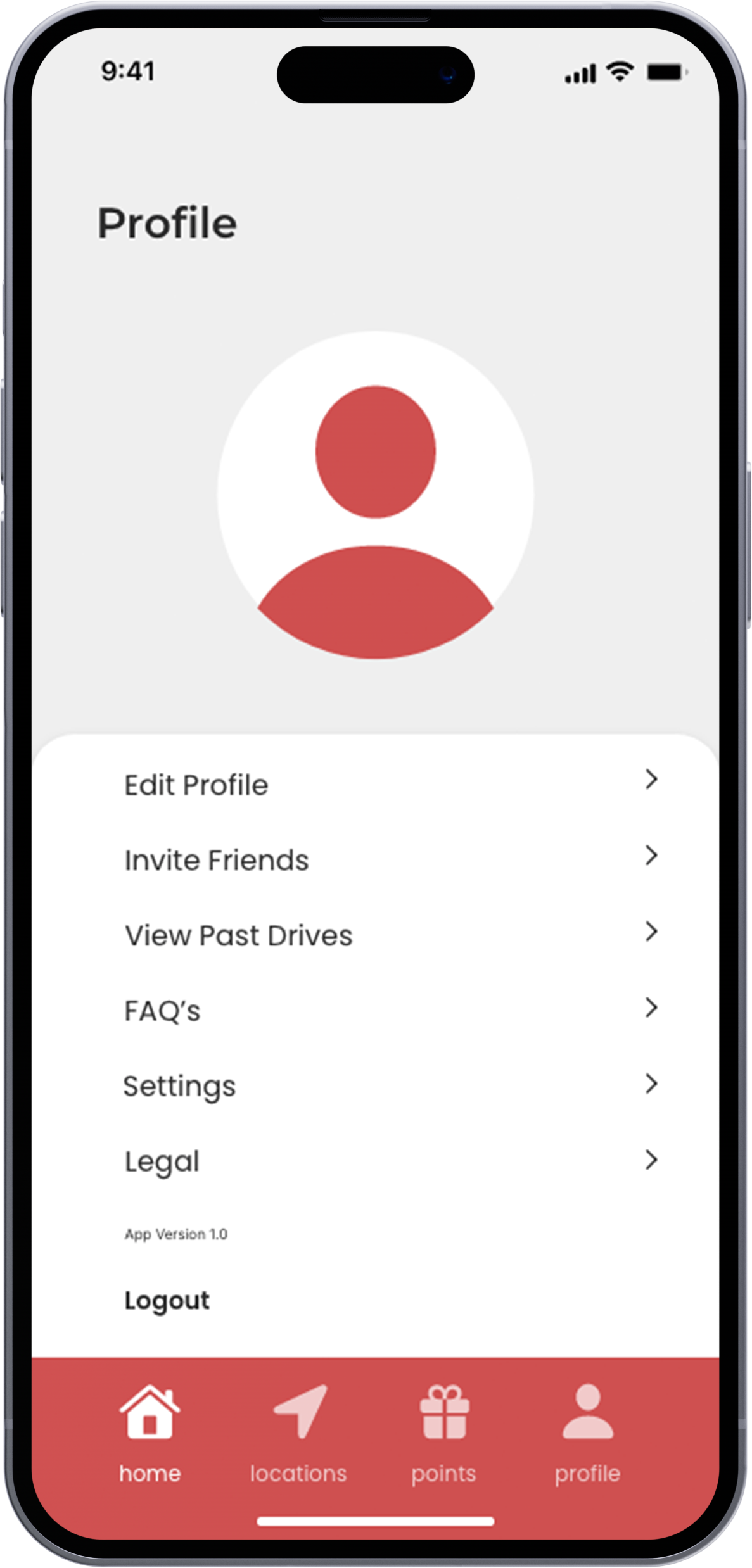
Main App Interface


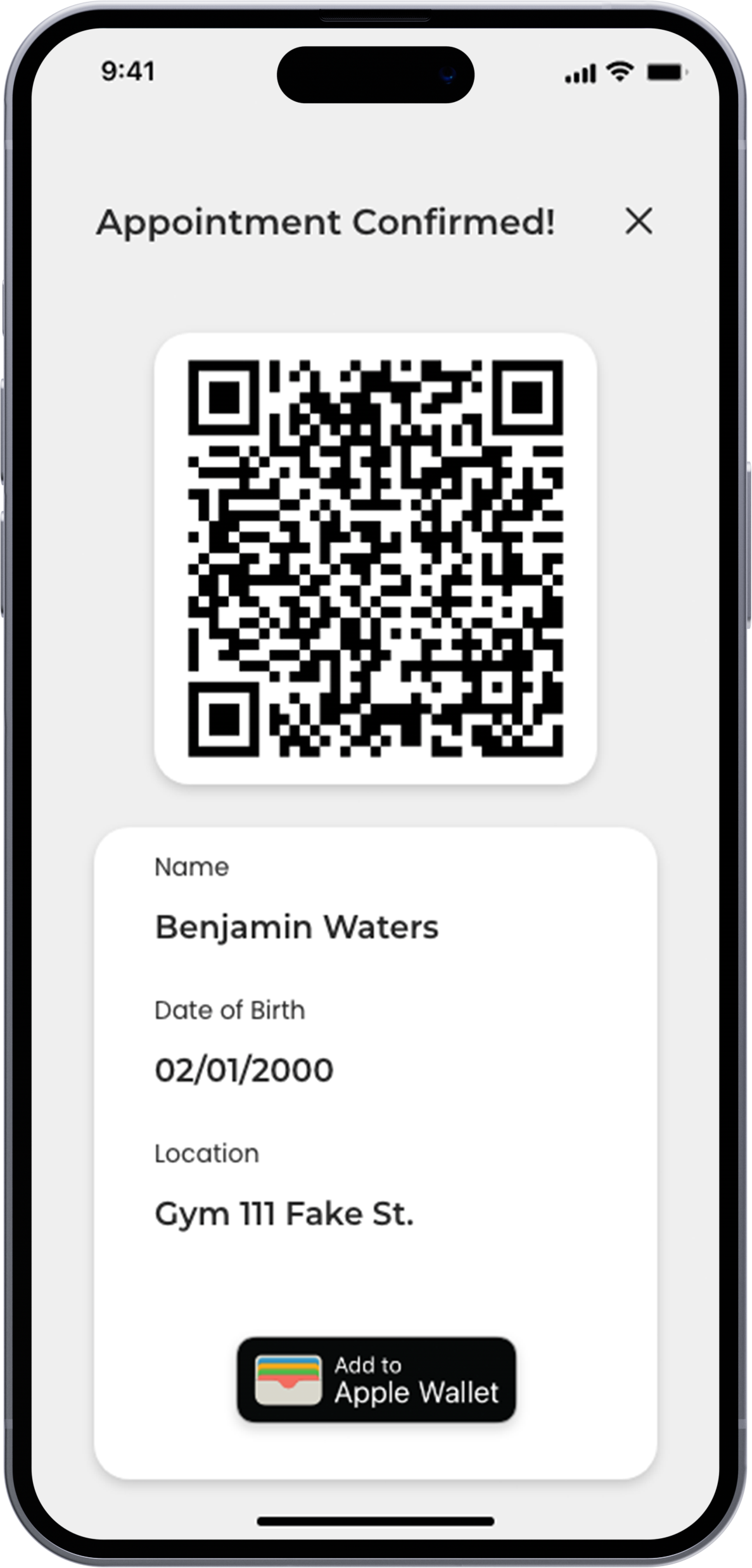
Setting-Up Donation / Pre-Check Question Examples

Mockups
